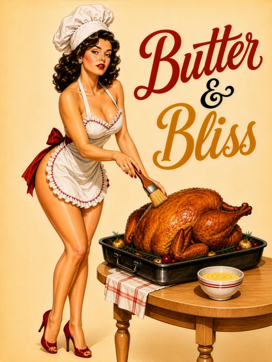
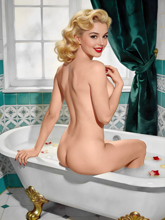
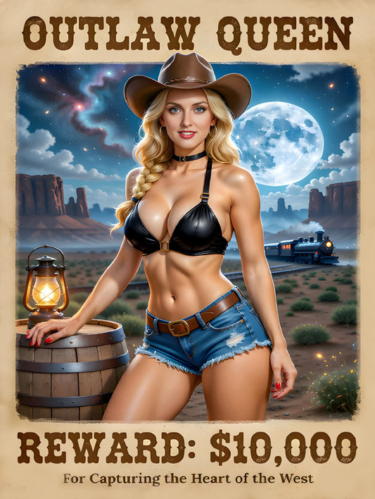
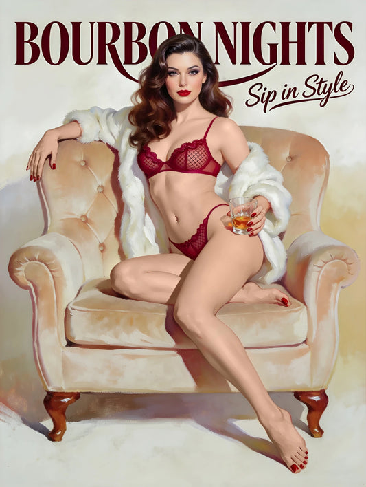
Color is not decoration. Color is communication.
In vintage pin up art, color does more work than any other single element — it establishes the emotional atmosphere, communicates the personality of the subject, creates visual impact, and determines whether a portrait feels warm or cool, playful or dramatic, intimate or commanding.
The greatest pin up artists of the golden age — Elvgren, Vargas, Armstrong — were not just technically brilliant painters. They were extraordinary colorists who understood instinctively how specific colors, in specific combinations, create specific emotional responses in viewers.
At Pinup Art Studio, color is one of the most important conversations we have with customers about their custom pin up portraits. In this comprehensive guide, we'll share everything we've learned about color in pin up art — from the foundational palette of the golden age to style-specific recommendations to guidance on which colors work best with different skin tones.
🌈 The Foundational Pin Up Color Palette
The color vocabulary of vintage pin up art was established in the 1940s and has remained remarkably consistent across the tradition:
The Essential Colors 🎨
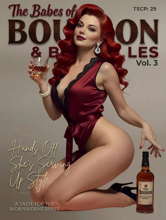
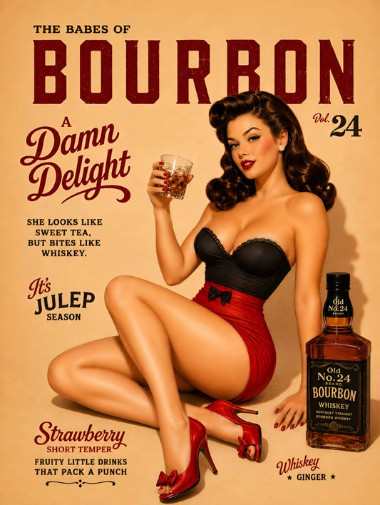
Cherry Red 🔴 — The single most important color in all of pin up art. Red appears in lips, in clothing, in roses, in backgrounds — and its presence instantly communicates the specific warmth and boldness that defines the tradition. Red is to pin up art what blue is to the sea: fundamental, irreplaceable, and immediately evocative.
True Red vs. Cherry Red vs. Scarlet:
- True red is neither warm nor cool — balanced and universally applicable
- Cherry red is slightly deeper and warmer — more romantic and vintage-authentic
- Scarlet is brighter and more attention-commanding — more theatrical and contemporary
Warm Skin Tones 🌸 — The pin up tradition idealizes skin as warm — peachy, golden, luminous with health. Even in naturally cool-toned subjects, vintage portrait artists typically warm the skin tones toward the peachy-golden ideal of the tradition.
Powder Blue 💙 — The cool complement to red's warmth. Powder blue in clothing, backgrounds, or accessories creates the specific 1950s pastel energy that defines classic pin up aesthetics.
Sunshine Yellow ☀️ — Joyful, warm, and immediately associated with mid-century American optimism. Yellow hair ribbons, yellow dresses, yellow backgrounds — all create specific warmth and accessibility.
Forest and Sage Green 🌿 — The most naturalistic of the pin up palette colors. Green in clothing, backgrounds, or accessories adds organic, grounded warmth.
Deep Black ⬛ — The dramatic counterpoint to all the warmth. Black in hair, in outlines, in clothing creates contrast that makes all other colors sing.
Ivory and Cream 🤍 — The most versatile neutral in pin up art. Cream backgrounds make skin tones glow. Ivory clothing creates sophisticated contrast.
🎨 Color Palettes by Portrait Style
Classic Pin Up 🌹
Primary colors: Cherry red (lips, dress accents), powder blue (background or clothing), warm cream (background or skin). Supporting colors: Sunshine yellow, soft coral, forest green accents. Avoid: Cool grays, neon colors, very dark or heavy palettes. The atmosphere they create: Warm, joyful, accessible. The feeling of a perfect summer afternoon in 1955.
Hollywood Glamour 🎬
Primary colors: Deep black (clothing, hair), ivory (background, skin), warm gold (jewelry, accents). Supporting colors: Deep jewel tones (sapphire, emerald), champagne silver. Avoid: Pastels, bright colors, anything that feels casual or underdressed. The atmosphere they create: Formal, sophisticated, dramatically beautiful.
Rockabilly 🎸
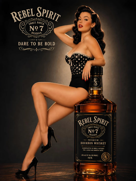
Primary colors: Scarlet red (lips, dress details), deep black (hair, clothing), crisp white (polka dots, contrasting elements). Supporting colors: Denim blue, warm brown leather tones, cherry motif colors. Avoid: Pastels, soft or gentle palettes — rockabilly is never subtle. The atmosphere they create: Bold, graphic, energetic. The visual equivalent of early Elvis at maximum volume.
Glam and Luxury 💎
Primary colors: Midnight black, champagne gold, deep jewel tones (sapphire blue, emerald green, ruby red). Supporting colors: Silver, cream, rich purple. Avoid: Pastels, casual colors, anything that feels humble or understated. The atmosphere they create: Opulent, theatrical, unapologetically spectacular.
Beach and Summer 🌊
Primary colors: Turquoise (water, accessories), warm coral (swimwear, sunset accents), golden sand tones. Supporting colors: Tropical botanical greens, sunshine yellow, warm orange. Avoid: Dark, heavy colors — the beach aesthetic is all light and warmth. The atmosphere they create: Carefree, sun-kissed, perpetually on vacation.
WWII and Vintage Military ✈️
Primary colors: Olive and khaki (clothing, backgrounds), warm red (lips, accents), cream and ivory. Supporting colors: Navy blue, warm brown leather tones, golden brass accents. Atmosphere: Patriotic, brave, historically resonant.
🌸 Color Guidance by Skin Tone
Different skin tones respond to colors differently — and understanding these relationships helps you choose the most flattering and harmonious palette for your portrait:
Fair Skin Tones 🌸
Most flattering clothing colors: Deep jewel tones (navy, emerald, burgundy), classic red, soft pastels. Colors to use with care: Very pale yellows or creams that can blur with fair skin if not carefully managed. Best portrait styles by color approach: Hollywood glamour (rich dark colors creating dramatic contrast), classic 1950s (warm pastels that complement rather than compete with fair skin).
Medium/Olive Skin Tones ✨
Most flattering clothing colors: Warm earth tones (terracotta, burnt orange, olive), deep jewel tones, bold coral and warm red. Colors to use with care: Very cool pastels that can fight with warm undertones. Best portrait styles by color approach: Rockabilly (bold warm colors that harmonize with warm undertones), beach portrait (tropical warm palette that enhances the golden quality of olive skin).
Deep/Dark Skin Tones 🌟
Most flattering clothing colors: Bright, saturated colors across the entire spectrum (bold colors sing against deep skin), rich jewel tones, gold and warm metallics. Colors to use with care: Very dark clothing colors that may reduce contrast. Best portrait styles by color approach: Glam portrait (the luxury color palette — gold, deep jewels, rich textures — creates extraordinary harmony with deep skin tones), Hollywood glamour (dramatic contrast is maximally powerful).
💄 The Red Lip: Universal Color Guidance
Red lipstick is the most important color decision in any pin up portrait. Here's how to choose the most flattering red for your specific features:
Blue-red (cool toned) — Works beautifully on cool and neutral skin tones. Creates the most dramatic, high-fashion quality lip. Associated with Hollywood glamour and the most formal pin up aesthetics.
True red (neutral) — The most universally flattering. Works on virtually every skin tone. The safest and most historically authentic choice.
Cherry red (warm) — Particularly beautiful on warm and olive skin tones. Slightly deeper and richer than true red. Extremely authentic to the vintage pin up tradition.
Scarlet (bright warm) — Best on deeper skin tones where its vibrancy is maximally effective. The most theatrical and attention-commanding choice.
🎨 Choosing Your Background Color
The background color sets the entire emotional atmosphere of your portrait:
Solid warm backgrounds (soft peach, warm cream, warm ivory) — Create intimacy and warmth. The figure glows against these backgrounds. Classic, timeless, extremely flattering.
Deep color backgrounds (navy, forest green, burgundy, charcoal) — Create drama and sophistication. The figure pops against deep backgrounds with maximum visual impact. Best for glam and Hollywood styles.
Abstract gradient backgrounds (soft color gradients) — Create a timeless, placeless quality. The figure exists in a beautiful nowhere — pure color, pure atmosphere.
Detailed setting backgrounds (vintage interior, outdoor landscape) — Create narrative and context. The figure exists in a specific world. Most associated with Elvgren's narrative-rich tradition.
Specify your background preference in your style notes when ordering at Pinup Art Studio.
❓ Frequently Asked Questions
Q: Can I request a specific color for my portrait that I love but isn't typically associated with pin up art? Absolutely — our artists work with your color preferences. If you love a particular color, specify it in your style notes and we'll incorporate it appropriately.
Q: How do I describe the colors I want in my style notes? As specifically as possible — "deep cherry red, not orange-red," "soft powder blue like a 1950s kitchen," "warm ivory rather than pure white." Color references from our Pinup Girl Prints collection are also helpful — "I love the color palette in image X."
Q: What if I don't have color preferences — can the artist choose? Yes — our artists make excellent color decisions based on the portrait style and the reference photo. Simply note "artist's discretion on color palette" in your notes.
🚀 Let Color Tell Your Story
Color in pin up art is not just decoration — it is the primary emotional language of the tradition. The right colors make your portrait sing. The right palette creates the atmosphere you've imagined. The right choices ensure that every time you look at your portrait, the color itself communicates who you are.
👉 Order your custom pin up portrait at Pinup Art Studio today and let our artists choose the colors that make your portrait extraordinary.
🎨 The right colors don't just look beautiful. They feel true. ✨